

A redesign of the core research engine to address years of organic complexity. Improving performance, clarity, and user efficiency by streamlining navigation, re-architecting data pathways, and defining clear UI patterns, the system is now faster, smarter, and ready for scale.

The Backstory
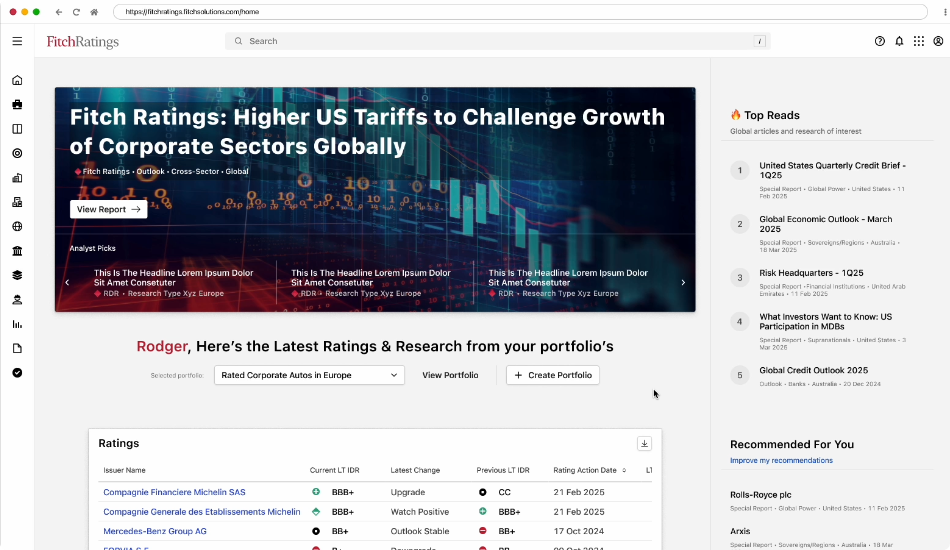
As the data and feature set expanded, workflows became fragmented: slowing down analysts and creating inconsistency. I led the redesign to unify research and data views, reduce friction, and rebuild trust in the platform’s speed and accuracy.
My Role
I led architecture and feature strategy, shaping how information was organized and accessed across the new experience.
-
Directed UX strategy for end-to-end research workflow.
-
Aligned design and dev teams on shared data visualization patterns.
-
Presented key decisions to stakeholders, SMEs, and leadership, ensuring alignment between user needs and business goals
-
Led iterative validation with analysts to confirm workflow accuracy.

Process
The process centered around uncovering inefficiencies in navigation and cross-data retrieval. Through workshops and testing, we identified high-friction paths and redefined how users interact with research, search, and result views.
Understand the Users
Held JTBD workshops and SME sessions to map how analysts actually worked. Used AI-assisted analysis of support tickets to surface recurring pain points and define clear problem areas.
Redefine the Architecture
Rebuilt workflows around shared, contextual components, allowing users to add portfolios or entities from anywhere without breaking focus. Simplified access to tools and data through modular design that fits naturally into their workflow.
Iterate, Test, Refine
Launched prototypes internally, measuring task completion time and usability. Iterated through feedback and analytics until key actions became near-instant and intuitive.
Design for Inclusion
Applied accessibility best practices from the start: semantic structure, contrast, and clarity ensuring a consistent and inclusive experience across all devices and user types.


The Results
-
+15% retention across the platform after launch
-
Accessibility award received for inclusive design and usability
-
Positive user feedback citing improved speed and clarity
-
Outperformed S&P Global’s equivalent tool in post-launch satisfaction metrics

Skills
-
Information Architecture / Release Planning
-
SME workshops
-
Wireframes / Storyboard
-
Interaction Design
-
High Fidelity Prototype
-
Documentation/Spec Sheets
-
Research / AB Testing
-
User Personalization / Hit scores
Technology Used
-
Figma, Confluence, and more Figma
-
Built with React components
-
D3/Plotly charting
-
Shared stack libraries
-
SPA Framework